Showing posts with label dia. Show all posts

Thursday, March 6, 2014

How Much Will a 15% Hair Cut Cost Your Investment Capital?

Over the past few weeks I have been watching the DOW and Transportation index closely because it looks and feels like the Dow Theory may play out this year and the stock market could take a 15% haircut.

But what if you skipped on the haircut and opted for a 40% refund?  What? Keep reading to find out how.

Keeping this post short and sweet, I think the U.S. stock market is setting up for a sharp selloff. And it will look a lot like the July 2011 correction. If my calculations are correct this will happen in the next 3-9 weeks and we will see a 15% drop from our current levels. Only time will tell, but I have a way to hedge against this with very little downside risk to you ETF portfolio.

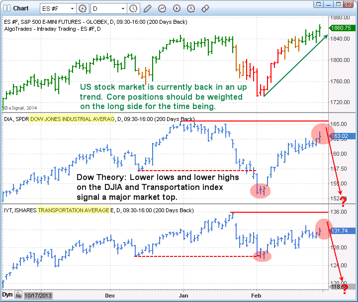
The Dow Theory Live Example for ETF Portfolio

The daily chart of the SP500 index below shows our current trend analysis with green bars signaling an uptrend, orange being neutral, and red signaling bearish price action. Currently the bars are green and we can expect prices to have an upward bias.

The Dow Theory could be  in play. When both the Transports (IYT) and the Dow Jones Industrial Average (DIA) cannot make higher highs and start making lower lows, according to the Dow Theory the broad stock market is topping.

We are watching the market closely because they have both made lower highs and lows.  This rally could stall in the next couple weeks and if so we expect a 15% correction.


Model ETF Portfolio


Take a look at the 2011 Stock Market Crash

Model ETF Portfolio Trading

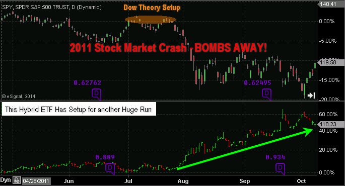
The chart above shows how fearful traders have a delayed reaction to moving money from stocks to a mix of risk-off assets.

The choppy market condition during August and September clearly helped in frustrating investors and created more uncertainty. This helped prices of this ETF portfolio fund rally long after the initial selloff took place. This is something I feel will take place again in the near future and subscribers of my ETF newsletter will benefit from this move.

Because we have a Dow Theory setup, our risk levels are clearly defined as to when to exit the trade if it does not play out in our favor. But with the potential to make 40% and the downside risk only being 4%, it’s the perfect setup for a large portion of our ETF portfolio. And just so you know this is not a precious metals trade as we are already long that sector and up 10% in that position already.

Get My Daily Video Forecasts & ETF Trades Today


Chris Vermeulen
The Gold & Oil Guy.com


Sunday, February 28, 2010

Weekend Gold, Silver, Oil & Index Charts

From guest analyst Chris Vermeulen....

Three weeks ago on February 5th, we saw an extremely high level of fear in the market with selling vs. buying volume at a 9:1 ratio. We note that in 2009 this extreme level of fear occurred at the bottom of each significant pullback.

Since this panic selling low in February 2010 we have seen stocks and commodities work their way higher, which we expected. Overall the broad market looks as though it’s trying to make a move higher.

Below are some ETF charts of gold, silver, oil and the indexes.


Gold lead the market higher in 2009 and also lead the market lower in December of 2009. It looks as though gold could be starting a new trend higher.

You can see the clean breakout of the down channel and then a test of the channel at support. This type of price action also forms an inverse head and shoulders pattern for those who like trading patterns.  This is very bullish price action.

SLV Silver ETF – Daily Trading Chart
Silver has much of the same chart features as gold, but is slightly skewed. This is not particularly surprising though, as silver virtually always behaves with less defined chart patterns due to its characteristically funky price action.


USO Oil Fund – Daily Trading Chart

As with gold and silver, oil’s trading chart has formed a pivot low also, but the trend line is much steeper than what I am looking for. I prefer a flatter trend line as price growth is more sustainable.

As you can see in on the USO chart, back in December price rallied at almost the same angle as is currently the case, and then notice what happened. Once the momentum died out the price dropped straight back down. I call steep trends like this a Parabolic Rally.

Scroll up and look at the first chart (GLD) and observe the parabolic rally going into December. It too suffered a sharp drop straight back down when momentum died out.


Stock Indexes – SP500, Dow Jones, Russell 2000

Last week the market sold down the first half of the week, then bounced back up forming a possible pivot low. The daily chart for these indexes look virtually the same as the GLD, SLV and USO charts above for the past 5 trading sessions.

But, one little thing has me concerned….
When looking at the 5 minute intraday charts (posted below) you can see at the very last minute before the market closed HUGE selling volume flooded the ETFs. The market ended up losing all of its gain for the day.

With any luck this was just end of the month hedge, mutual fund, etc. portfolio rebalancing. But I am somewhat concerned that more of this selling could step back into the market Monday or Tuesday.


Weekend Trading Conclusion:

Overall, last week started on a negative note but ended strong after forming a reversal pattern.

It looks as though stocks and commodities have formed an ABC retrace pattern and are now ready to move higher.

How much higher you ask?

Well, I believe 2010 is going to be a traders market. I envision an 8-12 month sideways consolidation (large bull flag) forming. If this materializes then buying on over sold dips, as we did on Feb 5th, and scaling out on strength at resistance levels will be our goal in the coming months.

A bunch of 4-8% trades is what I’m figuring, but with leveraged etfs we can double and triple those type of returns. Now that is something to anticipate with delighted optimism!

If you would like to receive Chris Vermeulen's free weekly trading reports please visit The Gold And Oil Guy.


Share

Wednesday, December 9, 2009

ETF Trading: Gold, Silver, Oil and the Dow Index

Etf trading has made it so easy for traders and investors to get maximum exposure to the entire market without the high fees of mutual funds and manager. There are now etfs covering almost every investment type whether it’s stocks, indexes, sectors, commodities, bonds, real estate, currencies etc…

In this short report I will quickly show a few charts on what is happening for precious metals and energy.

HUI – Gold Stock
This monthly chart of the gold stocks index you can see how easy it is to trade the market and avoid large sell offs when using technical analysis. Currently gold stocks are in a bull market, testing the 2008 highs. Until we are proven wrong buying stocks after a pullback is a winning strategy.


Trading the GLD ETF
We have been in the GLD etf for a few months as we ride this bull to new highs. This chart clearly shows how buying dips in a bull market can really pay off. I do have certain criteria which must be met before buying dips so I know the odds are in my favor.


ETF Trade Silver
Silver along with gold and oil are looking ready for an oversold bounce. I don’t think prices will jump and rally higher right out of the gate but eventually I feel the will head higher.


Crude Oil Fund - USO
Crude oil looks prime for the picking. It is currently oversold and testing 2 support levels. The downside momentum is still strong so this selling could last another 1-2 days but I’m expecting it to soon.

This is not a low risk setup. This is more of a short term aggressive contrarian play. For those of you who like heart pounding plays.


Natural Gas Fund - UNG
Natural gas has been taking its time to bottom. Virtually every bottom picker has been burned this year. I am starting to hear everyone get more bearish on it again which is great! It should bottom any day then! LOL….

Seriously it cannot get much more bearish for gas. We don’t have enough space to store it and companies are finding more natural gas in the ground every day. Because it sounds like a terrible investment it must be getting close to a bottom. If this is the start of a flat basing pattern, then I expect it could drag out for a few months before actually making a nice move up.


Dow Jones ETF - DIA
The Dow looks similar to gold and silver. I feel we are ready for a 1-2 day bounce then we go a little lower to shake traders out of the market before heading higher.


ETF Trading Conclusion
Gold stocks and the broad market are in a bull market. The recent pullback has many traders worried. I think this an opportunity to bet into some positions before the next rally. Buying the dips in a bull market is a low risk trade until proven wrong. I think we still have more of a pullback yet but then we could have a very profitable year end Xmas rally.

Natural Gas is just bumping along bottom I think. Not expecting any trade for a few weeks anyways.

Crude Oil looks like its ready for a move whether it is a 1-2 day bounce or the start of a new leg higher. If you loot at late Sept you can see USO broke down on heavy volume shaking most traders out of their positions just before the next leg higher, and this is what I feel it is doing now. Only time will tell.

Let’s see how the second half of this week unfolds.

Just click here to get a our free weekly newsletter for The Gold and Oil Guy.


Share

Sunday, November 29, 2009

The Dow, Dollar & Gold – What Goes Down Must Come Up

This year has been a very exiting time for traders and investors. We have seen a steady climb in prices with controlled pullbacks in the broad market and gold.

Using technical analysis we are able to quickly and accurately make informed decisions just from looking at the charts. In the charts below you will see how simple chart patterns along with support & resistance levels can provide excellent low risk entry points. Also you will see how candle stick charts can be an early indicator for prices to reverse direction.

DIA ETF – Daily
The DIA (Dow Jones Index Fund) is trending higher. By applying some basic technical analysis you are able to time your entry points having the odds in your favor.

In this chart I use two simple forms of analysis. The broadening formation (red trend lines), and horizontal support zones shown in blue.

Broadening Formations: This is when the price becomes more volatile making higher highs and lower lows. I think of it as one of those Megaphones for talking to large groups of people. So when a chart has this pattern it’s virtually yelling at me and I start taking profits or tightening my stops.

Horizontal Support Zones: I like to focus on support or resistance zones which are a little different than most traders. I do not use the top and bottoms of previous waves for these levels. Instead I take the average price then expect the support level to be penetrated somewhat as the level is tested. This is how the market keeps you out of the good trades. I cover this in great detail in my Stock Market Trading Education Course available in January.

Analysis: The DIA ETF looks ready for a pullback to the $99- 100 level.


GLD Exchange Traded Fund – Weekly
Gold has been on fire and riding this wave up has been very profitable thus far. Last week a doji candle was formed on the chart and this can signal a change in short term price action.

This chart shows some of the past doji candles and what happened to the price of gold soon after. What this candle is telling us is that the buying and selling pressure is equal. So we know momentum is slowing and we should expect a consolidation or correction.

Because gold has rocketed higher, indeed going almost straight up in the recent weeks, I expect a pullback to be very quick. A drop to the $110 or even the $100 level in the coming weeks is not out of the question, but we all know commodities can go parabolic for several months (straight up). This is why we continue to tighten our stops and keep holding out long positions.


US Dollar – Weekly
The US dollar has been up and down like a yo-yo in the past 15 months. The chart below clearly shows what has been happening with this currency and what I think we could see very soon.

The blue support zone (73-74) is a key pivot point for the dollar. That being said lets take a look at the chart.

During the time when the price is trending higher July 2008 – Feb 2009 we see lower wicks appear more often. This tells me that sellers pushed the price down early in the week but were then overcome by buyers nearer the end of the week. This is bullish price action. Also the broadening patterns during this timeframe’s tops indicate increased volatility and we know that is a sign of weakness.

From March 2009 – Sept 2009 the trend was down and there are longer upper wicks telling us buyers became over powered by sellers each time the price rallied.

In the recent 3 months we observe lower wicks meaning buyers are moving into the US dollar again. Knowing that there is major support below the current price I have to think the dollar could start to bottom around this level.


Trading Conclusion:
The broad market is becoming unstable and looks like it could have more of a pullback this week. I would not be adding to any long positions until we see the market trading near support. Three out of four stocks move with the market so it is crucial to understand the overall market direction when buying and selling stocks and commodities.

Gold is trading at a level which is fuzzy. The weekly chart is neutral and the daily chart is still on fire as it moves up. All we can do is ride our positions and keep raising our stop prices.

The US dollar could start to bottom over the next few weeks. Depending what happens with Dubai this week we could be in for a big bounce in the dollar as investors flock to safety as the US dollar is still the currency of choice if/when other countries start to have a financial melt down again.

Just click here to receive free weekly trading reports from The Gold and Oil Guy.

Share
Stock & ETF Trading Signals