Last week we identified a prime chart pattern in natural gas that matched our technical analysis and cycle price prediction system. This type of setup is our favorite as it leads to quick juicy profits and the last setup we had like this in natural gas I think we pocketed 74% return in 12 days using the ETF UGAZ.
Charts speak for themselves so let me show you what myself and our subscribers are into right now. We are long UGAZ and today (Wed March 7th) we locked in 9.1% profit with UGAZ on half the position. Our stops are now at break even, and we are looking for the final blast off stage, which may or may not happen, but we are ready!
We share this analysis so that you have some real predictive data to work with through March. We are not always 100% accurate in our modeling systems predictions or accuracy, but you can spend a little time reading our research reports through most of this year to see how we’ve been calling these market moves since well before the start of 2018. Visit the Technical Traders here to see what we offer our subscribers and learn how we can assist you in finding great trading opportunities. In fact, pay attention to the market moves as they play out over the next few weeks to see how accurate our research really is. We’re confident you will quickly understand that we provide the best predictive analysis you can find and are proud to offer our clients this type of research.
Get ready for this move and don’t miss the future ones. We’ll keep our members aware of all of these moves going forward so they can take advantage of these opportunities to generate profits.
Hope to see you in our member’s area, as well, where we can share more data and research to help you profit from these moves – visit The Technical Traders Right Here to learn more.
Trade ideas, analysis and low risk set ups for commodities, Bitcoin, gold, silver, coffee, the indexes, options and your retirement. We'll help you keep your emotions out of your trading.
Showing posts with label data. Show all posts
Wednesday, March 7, 2018
Here's Why it Might Be Time to Take Natural Gas Seriously
Labels:
Chris Vermeulen,
data,
futures,
Natural Gas,
newsletter,
Oil,
profits,
The Technical Traders,
UGAZ,
UNG
Wednesday, December 2, 2015
How Big the Gig Economy Really Is
By John Mauldin
There is growing awareness of what is being called the “gig economy.” It’s not just Uber driving or Airbnb. There are literally scores of websites and apps where you can advertise your services, get temporary or part time work, and do so from anywhere you happen to be.Some “gigs” actually pay pretty good money, but they are for people with specialized skills who prefer to live a somewhat different lifestyle than the typical 9 to 5’er does. My hedge fund friend Murat Köprülü has been busy researching and documenting this phenomenon and regularly regales me with what he finds.
He goes and spends evenings and weekends with young gig workers, trying to figure out what it is they really do and how they make ends meet in New York City. It turns out they need a lot less to support their lifestyle than you might imagine, and they prefer working intermittent gigs, being able to do what they want, and having no boss.
A close look at the data indicates that the gig economy is indeed big and growing. But there is a great deal of debate among economists about how big it really is.
It’s Much Bigger Than the Employment Data Suggests
Gig workers don’t seem to show up clearly in the BLS employment data. Typically, we would expect those working in the gig economy to appear in the self employed category, but that category is actually drifting downward in numbers—relatively speaking.But Harvard economist Larry Katz and Princeton’s Alan Krueger, who are working on research to document the rise of the gig economy in America, says that our current measures ignore the bulk of the gig economy.
From a story at fusion.net:
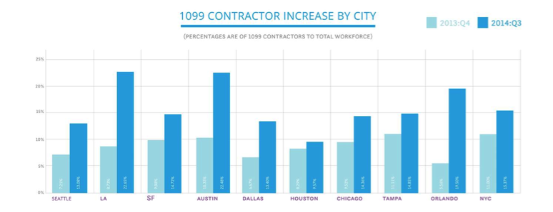
Katz said two pieces of evidence suggest current measures of self-employment and multiple-job holding are “missing a large part of the gig economy.” The first is that the share of the employed (and of the adult population) filing a 1099 form, the tax document “gig economy” workers must file, increased in the 2000s, even as standard measures of self-employment declined in the 2000s. Other groups have confirmed this: Zen Payroll, a site that tracks the sharing economy, found increases in the share of 1099 workers across many major U.S. metros.
Source: Zen Payroll via Small Business Labs
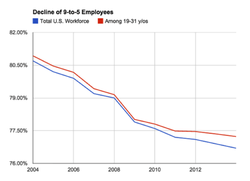
And data from research group EconomicModeling.com show the share of traditional, 9-to-5 workers in the labor force has declined…..
Source: Fusion, data via EconomicModeling.com
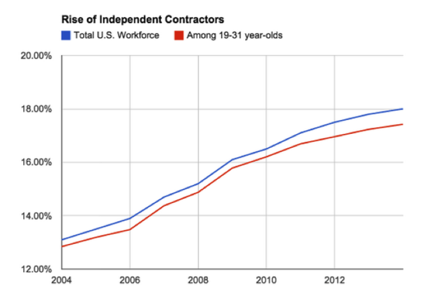
… while those who categorize themselves as “miscellaneous proprietors” is climbing.
Source: Fusion, data via EconomicModeling.com
A recent survey found 60 percent of such workers get at least 25 percent of their income from gig economy work.
And this report absolutely squares with what my friend Murat’s research is showing: that gig economy is not shrinking. On the contrary, it’s on the rise, and a quite rapid rise.
Subscribe to Thoughts from the Frontline
Follow Mauldin as he uncovers the truth behind, and beyond, the financial headlines in his free publication, Thoughts from the Frontline. The publication explores developments overlooked by mainstream news to help you understand what’s happening in the economy and navigate the markets with confidence.The article was excerpted from John F. Mauldin’s Thoughts from the Frontline. Follow John Mauldin on Twitter. The article How Big the Gig Economy Really Is was originally published at mauldineconomics.com.
Get our latest FREE eBook "Understanding Options"....Just Click Here!
Labels:
apps,
data,
employment,
financial,
Frontline,
John Mauldin,
markets,
Mauldin Economics,
money,
Uber
Tuesday, January 20, 2015
The Single Most Important Economic Statistic that the White House Never Talks About
By Tony Sagami
For the first time in 35 years, American business deaths now outnumber business births. —Jim Clifton, CEO, Gallup Polls
If you’ve ever owned a business, you know exactly what I’m talking about.
Difficult or not, self employment is extremely rewarding, and I wouldn’t have it any other way. Nor would the other 6 million business owners in the United States. Of those 6 million businesses, the vast majority are small “Mom and Pop” businesses. Here are more statistics on businesses in the U.S. :
- 3.8 million have four or fewer employees. That’s me!
- 1 million with 5-9 employees;
- 600,000 with 10-19 employees;
- 500,000 with 20-99 employees;
- 90,000 with 100-499 employees;
- 18,000 with 500 employees or more; and
- 1,000 companies with 10,000 employees or more.
Get our latest FREE eBook "Understanding Options"....Just Click Here!
For those reasons, the health (or lack thereof) of small business is the single most important long term indicator of America’s economic health. Warning: new data suggest that small businesses are in deep trouble.
For the first time in 35 years, the number of business deaths outnumbers the number of business births.
The US Census Bureau reported that the birth and death rates of American businesses crossed for the first time ever! 400,000 new businesses were born last year, but 470,000 died.
Yup, business deaths now outnumber business births.
Pay attention, because this part is important.
The problem isn’t so much that businesses are failing, but that American entrepreneurs are simply not starting as many new businesses as they used to. We like to think of America has the hotbed of capitalism, but the US actually is number 12 among developed nations for new business startups.
Number 12!
You know what countries are ahead of us? Hungary, Denmark, Finland, New Zealand, Sweden, Israel, and even financially troubled Italy are creating new businesses faster than us!
The reasons for the capitalist pessimism are many, but my guess is that the root of the problem comes down to three issues: (1) difficulty of accessing capital (loans); (2) excessive and burdensome government regulations; and (3) an overall malaise about our economic future.
Business owners are permanently smitten with an entrepreneurial bug, and the only thing that prevents them from seeking business success is the expectation that they’ll lose money.
Sadly, the lack of new business start ups is confirmation that American’s free enterprise system is broken.
"There is nobody in this country who got rich on their own. Nobody. You built a factory out there—good for you. But I want to be clear. You moved your goods to market on roads the rest of us paid for. You hired workers the rest of us paid to educate. You were safe in your factory because of police forces and fire forces that the rest of us paid for. You didn't have to worry that marauding bands would come and seize everything at your factory... Now look. You built a factory and it turned into something terrific or a great idea—God bless! Keep a hunk of it. But part of the underlying social contract is you take a hunk of that and pay forward for the next kid who comes along."
―Elizabeth Warren |
“When small and medium-sized businesses are dying faster than they’re being born, so is free enterprise. And when free enterprise dies, America dies with it,” warns Gallup CEO Jim Clifton.
I don’t believe for a second that America’s free-enterprise system is permanently broken. The pendulum will eventually swing the other way, but our economy will not enjoy boom times until the birth/death trends are reversed.
That won’t happen next week or next month. It will take serious, fundamental changes in tax, regulatory, and judicial rules, and I sadly fear that it will take several years for that to happen. Until then, our economy is going to struggle and will pull our high flying stock market down with it. Are you prepared?
If you’re not familiar with inverse ETFs, you’re ignoring one of your best defenses against tough times. An inverse ETF is an exchange traded fund that’s designed to perform as the inverse of whatever index or benchmark it’s designed to track.
By providing performance opposite to their benchmark, inverse ETFs prosper when stock prices are falling. An inverse S&P 500 ETF, for example, seeks a daily percentage movement opposite that of the S&P. If the S&P 500 rises by 1%, the inverse ETF is designed to fall by 1%; and if the S&P falls by 1%, the inverse ETF should rise by 1%.
There are inverse ETFs for most major indices and even sectors and commodities (like oil and gold), as well as specialty ETFs for things like the VIX Volatility Index.
I’m not suggesting that you rush out and buy a bunch of inverse ETFs tomorrow morning. As always, timing is critical, so I recommend that you wait for my buy signals in my Rational Bear service.
But make no mistake, the birth/death ratio is signaling serious trouble ahead. Any investor who doesn’t prepare for it is going to get run over and flattened like a pancake.
Tony Sagami
30 year market expert Tony Sagami leads the Yield Shark and Rational Bear advisories at Mauldin Economics. To learn more about Yield Shark and how it helps you maximize dividend income, click here.
To learn more about Rational Bear and how you can use it to benefit from falling stocks and sectors, click here.
The article Connecting the Dots: The Single Most Important Economic Statistic that the White House Never Talks A was originally published at mauldineconomics.com
New Video: 6 Simple Criteria that Guarantee Trading Success.....Just Click Here!
Labels:
commodities,
data,
eBook,
economic,
entrepreneurs,
ETF's,
future,
gold,
government,
money,
Oil,
sectors,
stock,
Tony Sagami,
volatility
Friday, April 25, 2014
Not All Debt Is Created Equal
By Dennis Miller
Optimal diversification: We all want it. Diversification is, after all, the holy grail of portfolio management. Our senior research analyst Andrey Dashkov has said that many times before, and he echoes that refrain in his editorial guest spot below.A brief note before I hand over the reins to Andrey. The last time the market tanked, many of my friends suffered huge losses. They all thought their portfolios were well diversified. Many held several mutual funds and thought their plans were foolproof. Sad to say, those funds dropped in tandem with the rapidly falling market. Our readers need not suffer a similar fate.
Enter Andrey, who’s here to explain what optimal diversification is and to share concrete tools for implementing it in your own portfolio.
Take it away, Andrey…
Floating-Rate Funds Bolster Diversification
By Andrey DashkovFloating rate funds as an investment class are a good diversifier for a portfolio that includes stocks, bonds, and other types of investments. Here’s a bit of data to back that claim.
The chart below shows the correlation of floating rate benchmark to various subsets of the debt universe.
As a reminder, correlation is a measure of how two assets move in relation to each other. This relationship is usually measured by a correlation coefficient that ranges from -1 to +1. A coefficient of +1 says the two securities or asset types move in lockstep. A coefficient of -1 means they move in opposite directions. When one goes up, the other goes down. A correlation coefficient of 0 means they aren’t related at all and move independently.
Why Correlation Matters
Correlation matters because it helps to diversify your portfolio. If all securities in a portfolio are perfectly correlated and move in the same direction, we are, strictly speaking, screwed or elated. They’ll all move up or down together. When they win, they win big; and when they fall, they fall spectacularly. The risk is enormous.
Our goal is to create a portfolio where securities are not totally correlated. If one goes up or down, the others won’t do the same thing. This helps keep the whole portfolio afloat.
As Dennis mentioned, diversification is the holy grail of portfolio management. We based our Bulletproof strategy on it precisely because it provides safety under any economic scenario. If inflation hits, some stocks will go up, while others will go down or not react at all.
You want to hold stocks that behave differently. Our mantra is to avoid catastrophic losses in any investment under any scenario, and the Bulletproof strategy optimizes our odds of doing just that.
When “Weak” is Preferable
Now, a correlation coefficient may be calculated between stocks or whole investment classes. Stocks, various types of bonds, commodities—they all move in some relationship to one another. The relationship may be positive, negative, strong, weak, or nonexistent. To diversify successfully and make our portfolio robust, we need weak relationships. They make it more likely that if one group of investments moves, the others won’t, thereby keeping our whole portfolio afloat.
Now, back to our chart. It shows the correlation between investment types in relation to floating-rate funds of the sort we introduced into the Money Forever portfolio in January. For corporate high yield debt, for example, the correlation is +0.74. This means that in the past there was a strong likelihood that when the corporate high yield sector moved up or down, the floating rate sector moved in the same direction. You have to remember that correlation describes past events and can change over time. However, it’s a useful tool to look at how closely related investment types are.
I want to make three points with this chart:
- Floating-rate loans are closely connected to high-yield bonds. The debt itself is similar in nature: credit ratings of the companies issuing high-yield notes or borrowing at floating rates are close; both are risky (although floating-rate debt is less so, and recoveries in case of a default are higher).
Floating-rate funds as an investment class are not as good a diversifier for a high-yield portfolio. They can, on the other hand, provide protection against rising interest rates. When they go up, the price of floating-rate instruments remains the same, while traditional debt instruments lose value to make up for the increase in yield.
- Notice that the correlation to the stock market is +0.44. If history is a guide, a falling market will have less effect on our floating-rate investment fund.
- The chart shows that floating-rate funds serve as an excellent diversifier for a portfolio that’s reasonably mixed and represents the overall US aggregate bond market. The correlation is close to zero: -0.03. This means that movements of the overall US bond market do not coincide with the movements of the floating rate universe.
Imagine two people walking down a street, when one (the overall debt market) turns left, the other (floating rate funds) would stop, grab a quick pizza, get a message from his friend, catch a cab, and drive away. No relationship at all… at least, not in the observed time period. This is the diversification we’re looking for.
Our Bulletproof income portfolio offers a number of options for diversification above and beyond what’s mentioned here. You can learn all about our Bulletproof Income – and the other reasons it’s such an important one for seniors and savers – here.
The article Not All Debt Is Created Equal was originally published at Millers Money
Don't miss this weeks great webinar with John Carter. “How HFT firms are causing you to lose money trading”. Click Here to Reserve Your Seat Now!
Labels:
data,
debt,
Dennis Miller,
diversification,
funds,
income,
losses,
portfolio
Tuesday, April 8, 2014
Learn to Trust Your Own Financial Judgment
Keep this goal in mind as you read on: solid income and growth with minimal risk and no catastrophic losses. Just tuck it in the back of your head.
Subscriber Brian A. wrote sharing a common concern:
"I subscribe to your newsletter for the purpose of diversifying my portfolio as well as taking more responsibility for my investment future. … I look at the soaring S&P and Dow and wonder if both are appreciating from strong fundamentals, or from the Fed's easy money policy. … I listen to my broker who spouts out information of a resurgence of manufacturing coming back to US soil and (says) equities are the place to be for the near future. The other side spouts banks are insolvent, businesses are closing, (and) if it wasn't for the Fed propping things up we would be in a recession. Some say we are in a recession. I would like to see you devote an article on the subject of the 'don't worry be happy' crowd verses the 'doom and gloom' crowd."
Folks who think things are turning around generally point to statistics published by the Congressional Budget Office (CBO). These numbers—the unemployment and inflation rates and the Consumer Price Index in particular—are used by the Federal Reserve to make or change policy. Those decisions affect the economy and the stock market.
If you swallow these numbers, you can point to a trend line going up. You may not think "happy days are here again," but you could make a case that we are headed in the right direction.
In contrast, the "gloom and doom" crowd point to data from statisticians like John Williams at Shadow Government Statistics, who make a good case against the accuracy of official government data. Williams' alternatives to the CPI, official inflation rate, and unemployment rate paint a much different picture.
Unemployment offers an easy example. When a person stops looking for work, the CBO no longer considers him unemployed. I guess that means if everyone just stopped looking, the unemployment problem would be solved.
Many in the gloom-and-doom crowd distrust the government and believe its statistics are produced for the benefit of politicians.
The gap between these two camps is wide. We recently published a special report called Bond Basics, offering safe ways to find yield in the current economy. Shortly after releasing our report, I attended a workshop with one of the top bond experts at a major brokerage firm. As I listened to his excellent presentation, I realized we agreed on many points: interest rates seem to be going up, the value of laddering and diversification, etc. We also agreed that investors (not traders) should buy bonds for one purpose: safe retirement income.
This speaker, however, recommended that baby boomers and retirees buying individual bonds only buy investment grade bonds and ladder them over an eight year period. Each year some would mature, and retirees would then replace them with other eight-year bonds. In a rising rate environment, retirees would eventually catch up he claimed. This expert mentioned inflation only once, remarking that it is "under control" and should remain low.
I went to the company's website and discovered that five year AAA bonds were paying 1.92%, and ten year bonds were paying 3.41%.
Then I went to Shadow Government Statistics. The official inflation rate as indicated by the CPI is hovering around 1.8%. However, using the same method used for calculating the CPI in 1990 (the government has changed the formula many times), the current rate comes to approximately 5.5%.
Now, it only makes sense to invest in long-term, high-quality bonds if you truly believe the government's CPI statistics. If, however, you that suspect inflation isn't quite so under control—even if you don't believe it's 5.5%—why would you invest in an eight-year bond that's virtually certain to lose to inflation?
The same logic applies to unemployment numbers. The official number is around 6.7% and coming down. Alternative calculations show a double digit unemployment rate that is rising. Should you invest heavily in stocks now? It depends again on whom you believe.
How should this affect your approach? If you hold the majority of your nest egg in cash or low-yield investments, you are losing ground to inflation. On the other hand, going all in the market if you are uncertain that the economy is improving could be equally disastrous.
A word of caution: do not let fear of getting it wrong immobilize you! It can be a very costly mistake. Keep learning and researching until you find investments you are comfortable with.
Let's look at the best- and worst-case scenarios with long term bonds. If you follow the advice of a bond salesman, you'll buy long-term corporate bonds. Ten year, AAA rated bonds currently yield around 3.41%. Assuming the bond trader is correct and inflation is not an issue, the best you could earn is 3.41%. Is that enough to get excited about when you factor in taxes and the risk of inflation?
In a recent article, I shared an example of a hypothetical investor who bought a $100,000, five-year, 6% CD on January 1, 1977. If he'd been in the 25% tax bracket, his account balance after interest would have been $124,600 at the end of five years. That's a 25.9% reduction in buying power because of high inflation during that five year period.
In that light, 3.41% does not look quite so appealing. Yes, inflation was particularly high during the Carter era, so apply a bit of common sense to the example. Nevertheless, what has caused inflation in the past? In general terms, governments spending money they don't have and printing money to make up the difference. Argentina is a timely example of this folly.
These concerns are why our research team and I paired up to produce Bond Basics. We think there are better risk and reward opportunities than long-term bonds available in today's market.
Investing in stocks is a different story. We cannot keep up with inflation and provide enough income to supplement retirement needs with bonds alone (unless you have a huge portfolio and are willing to buy higher-risk bonds). That's why our team picks stocks with surgical precision. We run them through our Five Point Balancing Test, recommend strict position limits, diversify across many sectors, and use appropriate stop losses.
Our premium publication is named Miller's Money Forever for good reason. We want to help you grow your nest egg in the safest possible manner under any market conditions. Neither the happy days nor the doomsday crowd can predict the future, so we prepare for all possibilities.
You've likely heard the refrain, "Inflation or deflation? Yes." It's a favorite of our friend John Mauldin. With that, baby boomers and retirees are forced to become kitchen-table economists and to sift through statistics that may or may not be accurate.
I haven't been shy about my opinion: I don't think the economy is improving, so retirees need to risk more than they would like in the market. That's why our Bulletproof Income strategy prepares for all market possibilities as safely as possible.
Whom should you believe? Well, is the person speaking trying to sell you something? Stockbrokers trying to garner your business tend to be optimistic about the economy. If someone is trying to sell gold or foreign currency investments, they are likely to cite a history of rising inflation and explain how their product can protect you. It doesn't mean either is wrong. And yes, the same point applies to the humble authors of investment newsletters.
At Miller's Money we share the reasoning behind every recommendation we make. We want our subscribers to know as much as we do about every pick—pros and cons. If you agree with our reasoning, act on our advice. If not, or if you have additional questions, ask us or sit tight for another pick. Never invest in something you don't understand or are uncomfortable with no matter who recommends it.
The bottom line is you have to read, learn, do your own research, and make your own judgments. Listen to all sides of any argument, and then do what you think is best.
What could be more important to baby boomers and retirees than protecting their money? Take the time necessary to teach yourself. In time you will become more comfortable trusting your own judgment. If you were savvy enough to make money, you are savvy enough to learn how to invest and protect it. Give yourself credit where it's due.
Sign up for a risk free trial of Miller’s Money Forever
The article Learn to Trust Your Own Financial Judgment was originally published at Millers Money.
Sign up for one of our Free Trading Webinars....Just Click Here!
Labels:
AAA,
bond,
data,
Dennis Miller,
inflation,
invest,
losses,
Market,
Millers Money,
retirement
Sunday, March 23, 2014
China’s Minsky Moment?
By John Mauldin
In speeches and presentations since the end of last year, I have been saying that I think the biggest macro problem in the world today is China. China has run up a huge debt, and the payments are coming due. They seem to be proactive, but will it be enough? How much risk do they pose for the global system?
This week as I travel to Cafayate I have asked my young associate Worth Wray to write up his research and our conversations on China. Worth has lived in China; and with his (and my) access to people with their fingers on the pulse of China, he has come up with some valuable insights. The hard part for him was to keep it in a single letter. China is a such a huge topic that writing about it can easily yield a tome.
I am lucky to have enticed Worth to come to work with me. He is extraordinarily talented and insightful as an economist, has the boundless energy of youth (which means he seemingly doesn’t sleep), and spent the last five years deep in one of the best training grounds that a young analyst could have. He brings his own extensive Rolodex to our organization. In the not too distant future, we plan to start writing a joint letter on portfolio design and construction, translating the macro insights we have into real world portfolios that can inform your own investing. Lots of I’s to dot and T’s to cross, but we are making progress.
I am delighted to be able to bring a talent like Worth to your attention. So let’s let him talk China to us and see where it takes us. [Note: as I do the final edits here in Cafayate, I see that Worth did an outstanding job of bringing the data together and making the story understandable. You want to take the time to read this!]
A Front Row Seat
By Worth Wray
Before I teamed up with John last July, I worked as the portfolio strategist for an $18 billion money manager in Houston, TX that, among its other businesses, co-managed (with an elite team of investors from the university endowment world) one of the largest registered funds of funds in the United States.
For a bright-eyed kid from South Louisiana, it was a life changing experience. I had a front-row seat for every investment decision in a multi-billion-dollar portfolio for almost five years; and along with my colleagues and mentors in Texas, North Carolina, New York, Shanghai, and Singapore, I had the chance to meet and interact with a long list of the most sought-after hedge fund, private equity, and venture capital teams. I often found myself in the same room with honest-to-god legends like Kyle Bass, John Paulson, JC Flowers, and Ken Griffin … and I forged lasting some friendships with their portfolio managers and analysts.
As you can imagine, the information flow was addictive. I spent thousands of hours poring over manager letters from six continents, doing my best to connect the global macro dots ahead of the markets and coming up with question after question for everyone who would return my calls. That experience plugged me in to an enduring network of truly independent thinkers, forced me to see the world from an entirely different perspective, and put me in an ideal position to figure out what it takes to navigate the unprecedented (not to say strange) investment challenges posed by a “Code Red” world.
Sometimes, combing through a mountain of manager letters felt like reading the newspaper years in advance. I remember watching with amazement as a free-thinking global macro investor named Mark Hart made a fortune for his investors by shorting US subprime mortgages and then shifted his focus to what he argued would be the next shoe to drop – a series of sovereign defaults across the Eurozone.
Mark explained how the launch of a common currency had allowed historically riskier borrowers like Portugal, Ireland, Italy, Spain, and France to issue sovereign debt for the same borrowing cost as Germany did… without any kind of fiscal union to justify the common rates. The resulting debt splurge led to a big increase in fiscal debts, drove an unwarranted rise in unit labor costs across the southern Eurozone, and essentially activated a ticking time bomb at the very foundations of the euro system. It seemed obvious that rates would eventually diverge to reflect the relative credit risks of the borrowers, but the market didn’t seem to care until it got very bad news from Athens. We all know what happened next.
Just as Mark and his team at Corriente Advisors had predicted, spreads blew out in Greece, then in Ireland, then in Portugal, then in Spain… and it now appears that Italy and France are veering toward a similar fate. When the euro crisis finally broke out, my colleagues and I were waiting for it, because Mark had already walked us through his playbook for a multi-act global debt drama.
Instead of blowing up in spectacular fashion, the Eurozone crisis has taken far longer to resolve than a lot of investors and economists expected (Mark, John, and myself included); but the euro’s survival thus far has been largely the result of extensive Realpolitik and an increasingly hollow narrative from Mario Draghi and the ECB laying claim to the wherewithal to “do whatever it takes” to preserve the single-currency system. Meanwhile, as Corriente understood, the likelihood of major defaults across the Eurozone rises every day that the ECB does the bare minimum to resist France’s and Italy’s slide toward deflation. It’s not over until the fat lady sings.
The point I am trying to make is that Mark saw the fundamental imbalances behind the global financial crisis in time to launch a dedicated fund in 2006, and he saw the root causes of the ongoing European debt crisis in time to launch a dedicated fund in 2007… precisely because he thinks of the global economy as one interconnected system peppered with a series of unstable and still unresolved debt bubbles. Mark is one of the most forward-thinking investors I have ever met and one of the best in recent decades at spotting the big imbalances that spell T-R-O-U-B-L-E.
I can’t tell you if he will be right about the next phase of the global debt drama. Predicting the actions and reactions of elected and unelected officials is next to impossible in a Code Red world, but some people have an eye for fundamental imbalances. And since Mark has been largely right in identifying the major debt bubbles that have plagued the world since 2007, John and I can’t comfortably ignore his warning.
As Carmen Reinhart and Kenneth Rogoff argued in their still-authoritative history of financial boom and bust over the past eight hundred years, “When an accident is waiting to happen, it eventually does. When countries become too deeply indebted, they are headed for trouble. When debt-fueled asset price explosions seem too good to be true, they probably are.”
The Bubble That Is China
Following his prescient calls on the subprime debacle and the European debt crisis, Mark identified in 2010 another source of instability that he warned could shake the global economy. And it took me by surprise. He warned that China was in the “late stages of an enormous credit bubble,” and he projected that the economic fallout when that bubble burst could be “as extraordinary as China’s economic outperformance over the last decade.”
To my knowledge, Mark Hart and his team at Corriente were the first of many global macro managers to anticipate a hard landing in the People’s Republic of China. Mark argued that the Middle Kingdom would land very hard indeed, popping speculative bubbles in the property and stock markets, sending foreign capital flying out the door, and triggering a rapid collapse in the renminbi … and even if the Chinese government could manage its economy away from a deflationary bust, they would be forced to devalue the renminbi to do so. In other words, Mark saw a much lower renminbi under almost every outcome.
It was a mind-blowing concept to me that the main driver of global growth (at the time) could not only implode but even drag the rest of the world down with it.
I can’t share the original Corriente China presentation with you for legal reasons, but here are a few public notes published by the Telegraph’s Louise Armistead after she attended one of Mark’s presentations in November 2010. These may look like obvious observations today, the sort you can find plastered all across the internet, but very few people were actually paying attention four years ago. And the data has only gotten worse since 2010 as rampant credit growth and insidious shadow lending have continued to fuel greater and greater capital misallocation.
In the presentation, which amounts to a devastating attack on the prevailing belief that China is an engine for growth, the financier argues that ‘inappropriately low interest rates and an artificially suppressed exchange rate’ have created dangerous bubbles in sectors including:
Raw materials: Corriente says China has consumed just 65pc of the cement it has produced in the past five years, after exports. The country is currently outputting more steel than the next seven largest producers combined – it now has 200m tons of excess capacity, more that the EU and Japan's total production so far this year.
Property construction: Corriente reckons there is currently an excess of 3.3bn square meters of floor space in the country – yet 200m square metres of new space is being constructed each year.
Property prices: The average price-to-rent ratio of China's eight key cities is 39.4 times – this figure was 22.8 times in America just before its housing crisis. Corriente argues: “Lacking alternative investment options, Chinese corporates, households and government entities have invested excess liquidity in the property markets, driving home prices to unsustainable levels.” The result is that the property is out of reach for the majority of ordinary Chinese.
Banking: As with the credit crisis in the West, the banks’ exposure to the infrastructure credit bubbles isn’t obvious because the debt is held in Local Investment Companies – shell entities which borrow from Chinese banks and invest in fixed assets. Mr Hart reckons that ‘bad loans will equal 98pc of total bank equity if LIC-owned, non-cashflow-producing assets are recognised as non-performing.’
The result is that, rather than being the ‘key engine for global growth’, China is an ‘enormous tail-risk’.
(Louise Armistead, The Telegraph, “Hedge fund manager Mark Hart bets on China as the next ‘enormous credit bubble’ to burst.” Nov. 29, 2010)
On a personal note, I obsessed over China’s culture, economy, and political system for years in college and then witnessed the country’s transformation firsthand during my time at Shanghai’s Fudan University in the summer of 2007. Then and later, I marveled at China’s strength relative to the developed world and the seemingly invincible central government’s ability to keep the economy chugging along with credit growth and fixed investment while it hoped for the return of its developed world customers then mired in the Great Recession.
It wasn’t what I wanted to hear … but I had to accept that Mark could be right. He had clearly identified a major imbalance which has continued to worsen over the last few years, and now we are just waiting for the next shoe to drop.
Four years later, Chinese production is slowing in the shadow of a massive credit bubble and in the face of aggressive reforms. Disappointing investment returns are revealing broad based capital misallocation; property prices are cooling (relative to other countries); and commodity stockpiles are mounting.
With China’s new policy of allowing defaults (historically, China’s default rate has been 0%), there is a real risk that follow-on events could spin out of control, raising nonperforming loan ratios and sparking a panic as bank capital is significantly eroded.
In the meantime, the renminbi is trading down, most likely due to an intentional effort by the People’s Bank of China to aid in the slow unwinding of leveraged trade finance.
Now the signs of a Chinese slowdown (and thus a global one, as the world is geared to 8% Chinese growth) are clear, and people around the world are meeting uncertainty with emotion. With that in mind, let’s dig into the data that really matters and try to get to the heart of China’s dilemma.
China’s Minsky Moment?
“China is like an elephant riding a bicycle. If it slows down, it could fall off, and then the earth might quake.” – James Kynge, China Shakes the World
As you can see in the charts above, China’s total debt-to-GDP (including estimates for shadow banks) grew by roughly 20% per year, from just under 150% in 2008 to nearly than 210% at the end of 2012 … and continued rising in 2013. Even more ominous, corporate debt has soared from 92% in 2008 to 150% today against the expectation that China’s government would always backstop defaults. That makes Chinese corporates the most highly levered in the world and more than twice as levered as US corporates, just as corporate defaults are happening for the very first time in more than 60 years.
By another measure, China has accounted for more than $15 trillion of the $30 trillion in worldwide credit growth over the last five years, bringing Chinese bank assets to roughly $24 trillion (2.5x Chinese GDP) and prompting London Telegraph columnist Ambrose Evans-Pritchard to tweet John and me a short message: “China riding tail of $24 trillion credit tiger. Tiger will eat Maoists.” And to that, I would respond that I hope the tiger doesn’t find its way to France. (You can follow John and Worth on Twitter at @JohnFMauldin and @WorthWray.)
Looking further into the debt problem, China is steadily incurring more and more credit for less and less growth – suggesting that the newer debt is less productive because it is being put to unproductive uses – as you can see in Chart 2 above. That explains why many analysts believe China’s official reported nonperforming loan ratio of 1% is more like 11% – or more than 20% of GDP.
To continue reading this article from Thoughts from the Frontline – a free weekly publication by John Mauldin, renowned financial expert, best-selling author, and Chairman of Mauldin Economics – please click here.
The article Thoughts from the Frontline: China’s Minsky Moment? was originally published at Mauldin Economics
Get our "Gold and Crude Oil Trade Ideas"
Labels:
capital,
China,
credit,
data,
exports,
GDP,
global,
gold,
investment,
John Mauldin,
Oil,
stockpiles,
Worth
Thursday, September 5, 2013
Things That Make You Go Hmmm…A Barrel of Monkeys
By Grant Williams
"What's more fun than a Barrel of Monkeys?
Nothing!"
Not my words, but those of the Milton Bradley Co., which still produces under license a game first created by a gentleman named Leonard Marks, who sold the rights to his simple but addictive game to Lakeside Toys in 1965.
It would be difficult to imagine a simpler premise for a game than that of Barrel of Monkeys. The rules of the game, printed on the bottom of the plastic barrel in which the monkeys are contained, are simplicity itself:
Dump monkeys onto table. Pick up one monkey by an arm. Hook other arm through a second monkey's arm. Continue making a chain. Your turn is over when a monkey is dropped.
Each barrel contains 12 monkeys but can accommodate, at a push, 24, which makes the game so much more enjoyable. What could be better than assembling a long chain of tangled monkeys, each reliant on those either side of it for purchase, with just the one person holding onto a single monkey's arm at the top end of the chain, responsible for all those monkeys dangling from his fingers.
Of course, with great power comes great responsibility; and that lone hand at the top of the chain of monkeys has to be careful — any slight mistake and the monkeys will tumble, and that, I am afraid, is the end of your turn. You don't get to go again because you screwed it up and the monkeys came crashing down.
On May 22nd of this year, Ben Bernanke's game of Barrel of Monkeys was in full swing. It had been his turn for several years, and he looked as though he'd be picking up monkeys for a long time to come. The chain of monkeys hanging from his hand was so long that he had no real idea where it ended.
That day, in prepared testimony before the Joint Economic Committee of Congress in Washington, DC, Bernanke stated that the Fed could increase or decrease its asset purchases depending on the weakness or strength of data:
The program relates the flow of asset purchases to the economic outlook. As the economic outlook — and particularly the outlook for the labor market — improves in a real and sustainable way, the committee will gradually reduce the flow of purchases.
I want to be very clear that a step to reduce the flow of purchases would not be an automatic, mechanistic process of ending the program. Rather, any change in the flow of purchases would depend on the incoming data and our assessment of how the labor market and inflation are evolving.
If we see continued improvement and we have confidence that that's going to be sustained then we could in the next few meetings ... take a step down in our pace of purchases. If we do that it would not mean that we are automatically aiming towards a complete wind down. Rather we would be looking beyond that to see how the economy evolves and we could either raise or lower our pace of purchases going forward.
"... we could in the next few meetings ... take a step down in
our pace of purchases."
Boom! That's all it took. The monkeys began to shiver, shake, and screech.Now, I have been saying for the longest time that these days nothing matters to anybody until it matters to everybody, and that is largely down to the Fed themselves (and their peers across the various oceans and borders who are complicit in this era of free money). The proof of my statement is seen in the fact that as soon as Bernanke mentioned that the "taper" — which, let's face it, EVERYBODY knows has to happen sooner or later — would possibly begin before the end of 2013, markets began to crumble.
The S&P 500 dropped a quick 6% on the outlandish idea that free money by the trillion wasn't going to continue forever, and this came as something of a shock to investors who had watched the index levitate relentlessly as the stimulus being applied by the Fed to the tune of $85bn a month did its job — and by "did its job" I wish I were talking about lowering unemployment and stimulating growth; but, alas, I'm talking about bolstering bank balance sheets and driving equity prices to unsustainable and unfairly valued levels.
As you can see from the chart below, the market turned around and recovered its losses pretty quickly as a seemingly endless procession of Fed governors and "friendly" journalists were rolled out to explain — in increasingly panicked tones — that everything was OK and that the esteemed Chairman didn't actually say they would definitely be cutting off the easy money.
Source: Bloomberg
In his own prepared remarks the following morning, Fed mouthpiece and Wall Street Journal reporter Jon Hilsenrath was quick to soothe:
(WSJ): The next step by the Fed could be especially tricky. One worry at the central bank is that a single small step to shrink the size of the program could be interpreted by investors as the first in a larger move to end it altogether. [Yesterday] Mr. Bernanke sought to dispel that view, part of a broader effort by Fed officials to manage market expectations.
If the Fed takes one step to reduce the bond buying, it won't mean the Fed is "automatically aiming towards a complete wind-down," Mr. Bernanke said. "Rather we would be looking beyond that to seeing how the economy evolves and we could either raise or lower our pace of purchases going forward. Again that is dependent on the data," he said.
After the scrambling was over and the 6% air pocket was safely navigated, the S&P 500 first regained and then surpassed its previous high. At this point, the Punditocracy (as my buddy Scott calls it) declared that any "taper" had now been priced in.
And there the story should have ended. Nothing to see here folks, get back to your couches.
But of course it didn't end.
To continue reading this article from Things That Make You Go Hmmm… – a free weekly newsletter by Grant Williams, a highly respected financial expert and current portfolio and strategy advisor at Vulpes Investment Management in Singapore – please click here.
Wednesday, August 21, 2013
Andrey Dashkov: Peak Gold
By Andrey Dashkov, Research Analyst
In the mining business, it is said that grade is king. A high-grade project attracts attention and money. High grade drill intercepts can send an exploration company's stock price higher by an order of magnitude. As a project moves to the development stage, the higher the grade, the more robust the projected economics of a project. And for a mine in production, the higher the grade, the more technical sins and price fluctuations it can survive.
It is also said that the "low hanging fruit" of high-grade deposits has all been picked, forcing miners to put lower-grade material into production.
You could call it Peak Gold.....and argue that the peak is already behind us. Let's test that claim and give it some context.
One of the ways to look at grades is to compare today's highest-grade gold mines to those from the past. We pulled grade data from the world's ten highest grade gold mines for the following chart.
As of last year, grades at the richest mines have fallen an average of 20% since 1998. However, except for 2003, when the numbers were influenced by the Natividad gold/silver project (average grade 317.6 g/t Au) and Jerritt Canyon (245.2 g/t Au), the fourteen-year trend is relatively stable and not so steeply declining. The spike in 2003 looks more like an outlier than Peak Gold.
However, these results don't provide much insight into the resource sector as a whole, one reason being that the highest-grade mines have vastly different production profiles.
For example, Natividad—owned by Compañía Minera Natividad y Anexas—produced over 1 million ounces in 2003 from ore grading over 300 g/t gold, while the San Pablo mine owned by DynaResource de Mexico produced only 5,000 ounces of gold from 25 g/t Au ore in the same year.
This made San Pablo one of the world's ten highest-grade operations in 2003, but its impact on global gold supply was minimal. In short, the group is too diverse to draw any solid conclusions.
We then turned to the world's top 10 largest operations, a more representative operation, and tallied their grades since 1998.
The picture here is more telling. Since 1998, gold grades of the world's top ten operations have fallen from 4.6 g/t gold in 1998 to 1.1 g/t gold in 2012.
This does indeed look like Peak Gold, in terms of the easier-to-find, higher-grade production having already peaked, but it's not as concerning as you might think. As gold prices increased from $302 per ounce at the end of 1998 to the latest price of $1,377, both low-grade areas of existing operations and new projects whose grades were previously unprofitable became potential winners.
Expanding existing operations into lower-grade zones near an existing operation is the cheapest way to increase revenue in a rising gold price environment. So many companies did just that.
Indeed, the largest gold operations—the type we included in the above chart—would be the first ones to drop their gold grades when prices are higher, simply due to the fact that what they lose in grade they can make up in tonnage run through existing processing facilities. Larger size allows lower-grade material to be profitable because of economies of scale. New technologies have helped to make lower-grade deposits economic as well.
So, at least until 2011, the conventional wisdom of "grade is king" was being replaced by "size is king."
However, production costs have been increasing as well—and have continued increasing even as metals prices have retreated in recent years. Rising operating costs and capital misallocations (growth for growth's sake, for example) are at least partly to blame for miners' underperformance this year.
Suddenly, grade seems to be recovering its crown. It remains to be seen whether more high-grade discoveries can actually be made, or whether Peak Gold is actually behind us.
The Takeaway
Truth is, there is no king. Grade and size, although among the most important variables in the mining business, tell only part of the story. Neither higher grades nor monster size prove profitability by themselves—the margin they generate at a given point in time is what matters most. And then what the company does with its income matters, too.
It's true that high enough grade can trump all other factors in a mining project, but it's the task of a company's management to navigate the changing environment, control operating costs, and oversee the company's growth strategy so that it creates shareholder value.
The resource sector has had a sober awakening, and now we see many companies changing their priorities from expansion to profitability, which depends on many parameters in addition to grade. This is a good thing.
As for Peak Gold, if that does indeed turn out to be behind us, the big, bulk-tonnage low-grade deposits that are falling out of favor today will become prime assets in the future. It'll either be that or go without.
Times may be tough, but the story of the current gold bull cycle isn't done being written. The better companies will survive the downturn and thrive in the next chapter. Identifying these is the ongoing focus of our work.
How about a project that's high grade and big? We recommended a new producer that has such an asset, and it hasn't been this cheap since its IPO. Find out who it is in the August issue of Casey International Speculator. Start your risk-free trial with 100% money-back guarantee here. |
Labels:
Andrey Dashkov,
casey research,
data,
gld,
GLL,
gold,
mines,
peak
Tuesday, February 19, 2013
EIA: Gulf Coast Crude Stocks Generally Fall Sharply in December Because of Inventory Taxes
Crude oil inventories in the Gulf Coast often fall sharply in December, averaging a decline of nearly 8 million barrels in that month from 1981 through 2011. Preliminary data for December 2012 show a decline of more than 12.5 million barrels in the region, bringing end of year crude inventories to approximately 165 million barrels.
The reason for this sharp decline: December 31 is the typical assessment date for taxes on crude oil stocks that are collected by many states/counties/municipalities in regions where the bulk of U.S. crude oil and petroleum product inventories are stored. To decrease crude inventories, companies can do a combination of the following: delay or decrease imports, increase runs at refineries, move crude oil out of the taxable region, or sell crude oil to other market participants.
Following December declines, inventories tend to recover in January. Although large crude oil draws can be an indication of demand outpacing supply, the December phenomenon typically does not reflect tightening of the oil market, but rather how companies in the region are taxed on crude stocks. During the middle of the year, crude inventories in the Gulf Coast region both rise and fall, averaging out to relatively small net changes in stocks for a given month.
At the end of December each year, parts of Texas and Louisiana, where significant volumes of crude oil are stored, assess ad valorem taxes (meaning, according to value) on end of year crude oil inventories. These taxes, along with the generally accepted accounting practice of last in, first out (LIFO) method used to value the assets, create an incentive to draw down crude stocks in the region at the end of the year in order to reduce the tax bill.
If oil prices have risen during the year, this accounting practice gives companies stronger incentive to reduce inventory because doing so will further limit their tax exposure. Conversely, if oil prices have fallen throughout the year, companies have less incentive to reduce crude held in storage.
Get our Free Trading Videos, Lessons and eBook today!
Tuesday, July 3, 2012
Is the SP 500 Closing in on a Top?
Friday’s strong move to the upside caught a lot of traders on the wrong side of the market. Regardless of whether financial pundits refer to it as a short squeeze or simply panic level buying is largely irrelevant. Time and price are always the final arbiters of financial markets. Price on Friday was clearly telling us that too many market participants were shorting equities and the Euro.
The news coming out of the European Summit is what drove prices higher according to most media outlets. However, few traders have actually taken the time to research the fact that Germany has not technically agreed to the European Stability Mechanism legislation at this point.
The German Constitutional Court has delayed the passage of the ESM legislation on the grounds that this court needs to affirm the agreement is constitutional. Several high profile politicians in Germany have allegedly filed multiple law suits surrounding the new ESM law.
Should the German Constitutional Court determine the ESM legislation is unconstitutional a referendum will go before the German people. The last thing the Eurocratic blue bloods and their banking cartel minions want is regular people actually having a say in the outcome of the Eurozone project.
Ultimately the German people do not appear to be in favor of propping up the rest of Europe in exchange for more empty promises of austerity. Furthermore, the German people recognize that they are taking on a massive risk by loaning money to insolvent banks and other Eurozone sovereigns who have not proven to be prudent with managing their current fiscal conditions.
The decision made by the German high court could have a far-reaching impact on the price action in European financial markets as well as in U.S. domestic financial markets. The outcome of the forthcoming decision will carry far more weight than Friday’s June unemployment report. Already I am reading that should the unemployment number come in significantly weaker than expected Ben Bernanke may work to convert Operation Twist into full blown QE III at the next FOMC Meeting.
The addiction to cheap money by large institutional banks will not end until the Fed is no longer able or willing to continue to print money. Should economic data continue to weaken going into earnings season I am sure the banter regarding QE III will increase at lightning pace and bad news for the economy will be good news for stocks. Poor economic data will increase the likelihood for additional liquidity being provided through a 3rd Quantitative Easing initiative.
Leaving the macroeconomic data aside and focusing on market technicals, we find several unsettling situations in a variety of underlying assets and indicators. The warnings are largely falling on deaf ears as the equity bull parade continues. Before we talk about the S&P 500 Index directly, perhaps we should examine some of the indicators and underlying assets that are sending out bearish smoke signals.
The first chart I would draw your attention to is the McClellan Oscillator which is a widely followed and focuses on market breadth as a possible market indicator for tops and bottoms. Note the key high and low points of the Oscillator and how they correspond with the S&P 500 Index.
Read the entire article and see the charts for "Is the SP 500 Closing in on a Top?"
Get our Free Trading Videos, Lessons and eBook today!
Labels:
bearish,
data,
ESM,
German,
indicators,
McClellan Oscillator
Wednesday, October 26, 2011
EIA Launches New Electricity Focused Web Page
Yesterday, EIA launched a new web based report called the Electricity Monthly Update, replacing the Monthly Flash Estimates for Electric Power Data. This new product introduces a feature story, interactive graphics, a new presentation flow, and new electricity industry data sources.
Source: U.S. Energy Information Administration, Electricity Monthly Update.
Labels:
Crude Oil,
data,
EIA,
Electricity,
Natural Gas
Wednesday, March 31, 2010
Rare Glimpse into MarketClub....Once a Year 2 Week Trial, Now Open!
I'll keep this short as I know you're busy, I just got word from my inside contact at MarketClub, that they're opening up the premium service for a no cost 2 week trial!
Just click here to get instant access here....
There are 4 powerful tools available to members that you, as a free trial member, will have access to. Smart Scan, Trade School, Chart Analysis, and Data Central will be opened up just for you.
The other major bonus about this trial is that their, customer support team will be providing UNLIMITED support! You can call or email for an instant response (I know because I've used it) to any question, comment or concern. They've added another support person (hired a month ago just to train her) to ensure that all calls and emails get answered as quickly as possible.
Again, here's that link and I'll get you more info a little bit later, but I'd recommend you jump on this now.
Share
Labels:
data,
MarketClub,
Stochastics,
support,
Trade school
Tuesday, September 15, 2009
Crude Consolidates Just Below $70 Barrel
Crude futures are returning earlier gains after failing to break through the psychological $70/bbl level following much better than expected Retail Sales data. The optimistic Retail Sales data is an encouraging development for battered U.S. consumption. A recovery in Retail Sales implies an improvement in broad based consumption, lifting the price of crude. However, the positive impact from the out performance of U.S. data is being countered by a collapse in the GBP/USD. BoE Governor King delivered another monetary shock today (refer to GBP/USD analysis), sending the Pound sharply lower against all of its major crosses. The negative performance of the GBP/USD is dragging on crude since it is a dollar denominated commodity. On the other hand, it is encouraging to see the EUR/USD and gold holding steady despite the.....Read the entire article
Subscribe to:
Posts (Atom)